IW4 - Provision of Safety Signage Around Inland Waters
| Issue Date | Effective Date | Version |
|---|---|---|
| 07/2024 | 01/07/2025 | 2.0 |
Purpose
To provide guidance on appropriate aquatic safety signage requirements, planning, and specific applications for inland waterways.
To provide guidance so that inland waterway safety signage clearly communicates safety information to the public in accordance with national and international safety standards.
Background
Safety signs highlight health and safety hazards, reducing inadvertent exposure to risks and confusion.
Education is essential for effective safety information systems.
Signage serves as an administrative control but does not replace higher-order risk controls or incident minimisation measures.
Accurate, standardised signage brings foreseeable risks to the attention of individuals, enhancing safety awareness and reducing legal liability for landowners
Australian research into the efficacy of safety signage in national parks found that in order for signs to be effective, signage must be:
- Noticeable: Features that contribute to this include using shape, size and colour in ways that contrast with the site’s surroundings. Careful placement, especially in relation to other surrounding informational signs, and the orientation of the sign in relation to the hazard can help draw attention to it.
- Readily encoded: This is often achieved with effective graphic images of the hazard and short, familiar words. Large, well-spaced text that is easily read, including at a distance, is important in a natural environment that is full of “distractions”.
- Easily comprehended. Signs that use clear signal words such as DANGER or WARNING, and the effective use of colours and symbols, are particularly helpful to non-English speaking visitors. There needs to be a clear message about what a visitor should and should not do, and the consequences.
- Compliance-inducing: Signs should be placed close to hazards. Use logos and prohibition symbols to strengthen safety messaging and indicate enforcement authority.
The content herein, while originally developed by Royal Life Saving Society Australia and Surf Life Saving Australia through the Victorian Branch, on behalf of the Australian Water Safety Council, has been codified in Australian and International Standards. The current most applicable standard is ISO 20712.3: 2021 - Water Safety Signs and Aquatic Location Safety Flags.
Scope
This guideline applies to those responsible for inland waterways or public access to them, including land or water managers and activity operators (referred to as the ‘responsible person’). It also covers manufacturers and distributors of safety signage and equipment. A shared responsibility approach should be adopted to reduce drowning or serious aquatic injuries.
Description
The responsible person should install appropriate aquatic safety signage to inform users of hazards, risks, and necessary information at inland waterway locations.
Signage should comply with Australian and International Standards (e.g., ISO 20712.3:2021).
Placement should be based on aquatic risk assessments and drowning prevention plans, and content should align with the Waterfront Classification and Associated Risk Treatment Measures Summary in Appendix C.
Aquatic Safety Signage Overview
Presentation, structure and heirarchy of signage information
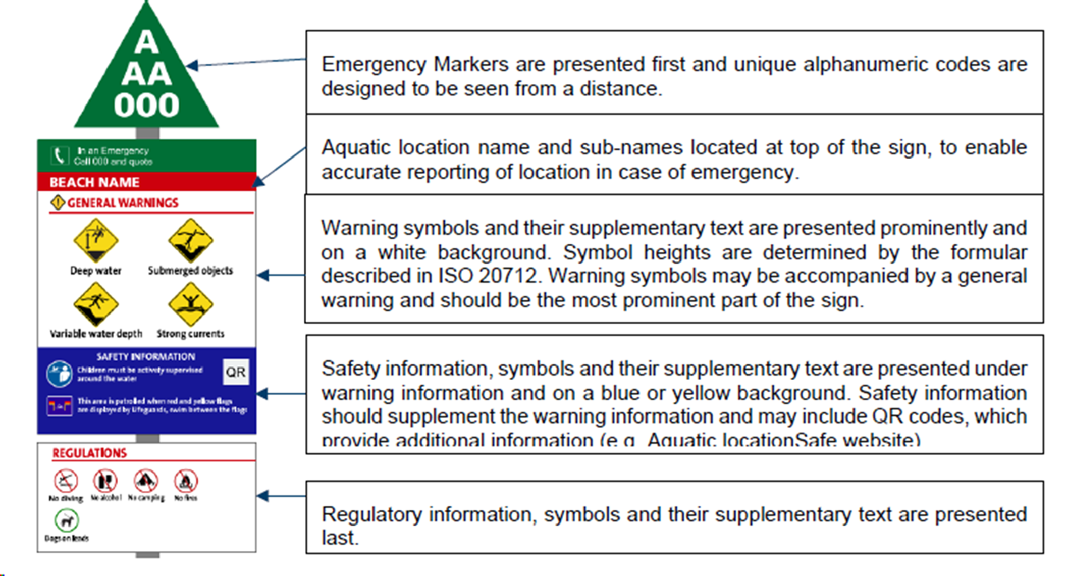
Consistent presentation, structure, and hierarchy of signage information are crucial for comprehension. Use a grid structure and group information into categories for clarity. The recommended hierarchy is:
- Location information/contact details
- Hazards and warnings
- Information
- Regulations/prohibitions. Multiple signs should be manufactured and fixed appropriately for the aquatic environment.
Determining appropriate signage requirements
Determining the most appropriate signage at an aquatic location is a detailed process that should include assessing the hazards and associated risks which need signage then determining:
- the classification of sign to be used
- the location and size of signs
- the mounting height
- the symbol height and maximum viewing distance
- the supporting text to support the symbol
- the use of single or multiple signs
- the lighting and illumination where the signage will be located
- the environment where the signage will be located
- the material, construction and physical properties
- the fixing method of the signs
- how the signs will be installed
- any permits required
The owner or operator of an inland waterway or the land providing public access to the inland waterway should ensure that the type of sign(s) used is suitable for the intended purpose and able to weather the environment in which it is installed.
Location and size of signs
Plan the location and size of water safety signs to ensure key hazards are clearly identifiable, enabling users to take appropriate action.
The following matters (issues, factors) should be considered:
- location of hazards and their signage;
- location of entrances/access to facilities;
- location of any other signs;
- location of architectural features, décor, structures, vegetation or people that could conceal or divert attention from signs;
- lighting level and characteristics under both normal and mains-failure conditions;
- appropriate supplementary text to water safety signs;
- appropriate information on multiple signs
The following principles should be taken into account when planning safety signage at an aquatic location; signs should:
- be sited conspicuously within the normal field of vision;
- contrast to their surroundings;
- NOTE: The contrast and conspicuousness may be increased by the provision of an outer border or by mounting on a sign board with a colour contrasting to the surroundings.
- be visible prior to exposure to the hazard;
- be sited at the same height throughout the inland waterway location, as far as is reasonable;
- take precedence over all other signs
- be placed so that they are not themselves a hazard (line of sight or tripping);
- be placed at higher risk locations, if applicable
- be illuminated, if applicable, to ensure that they are visible and legible
Care should be taken to avoid over-provision of safety signs at one location as this can confuse viewers and result in individual safety messages not being noticed and understood.
Signs should not be placed on moveable objects where a change of position would void the purpose of the sign or cause it to be out of sight. This does apply to signs that are intended to be portable or temporary.
Location Information / Contact Details
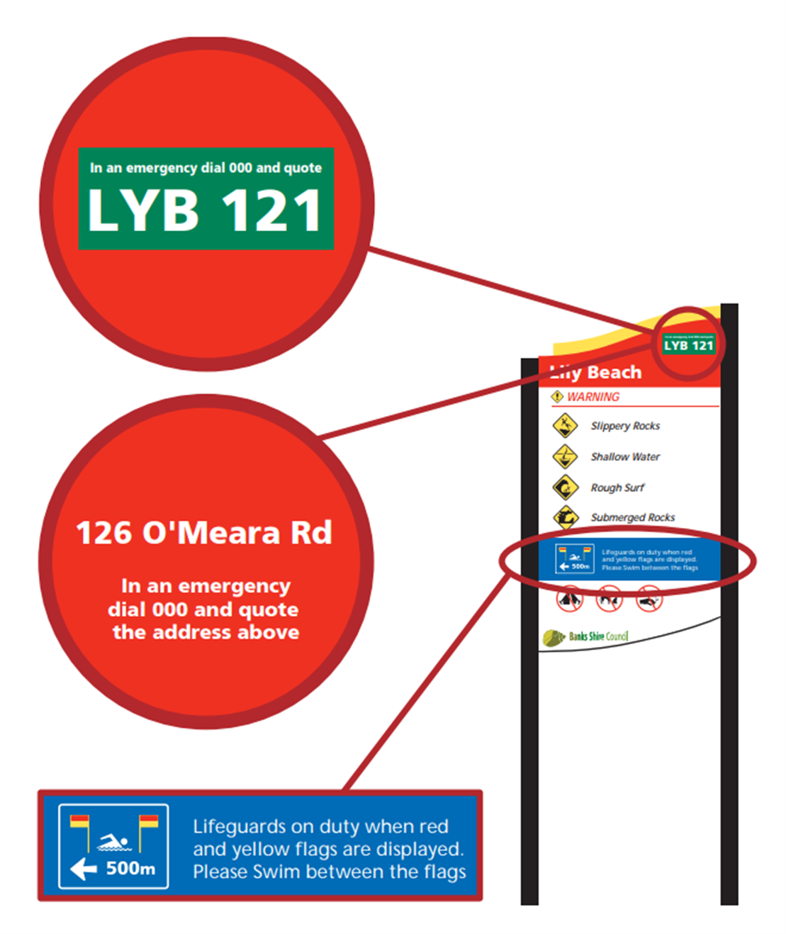
Emergency markers and/or address
Ensuring timely emergency response to an incident location is of critical importance.
When contacting triple zero (000), identifying the emergency location is a critical element in the delivery of a timely and appropriate emergency response.
Location information challenges are particularly difficult for ‘open space’ locations with no set addresses such as inland waterways, beaches, parks, and trails.
Where an address is not available, emergency markers are designed to pinpoint your exact location during an emergency in public open spaces or hard to define places.
A considered and coordinated approach to applying address and/or emergency markers such as, applying unique emergency markers wherever possible in order to specifically direct emergency services to an exact location is recommended.
Address and/or emergency markers should be presented first, and the alphanumeric codes should be designed to be seen from a distance.
Note: there are costs associated with the design set up and implementation of emergency markers.
The number or address should be quoted over the phone to emergency services so they can respond to the location of the distress call. It is important to ensure accuracy of these markers and to register them with emergency services.
Hazards and Warnings
Use of symbols
Aquatic safety signage should conform to ISO 20712.3: 2021 - Water Safety Signs and Aquatic Location Safety Flags and ISO 3864-3:2024Graphical symbols - Safety colours and safety signs - Part 3: Design principles for graphical symbols for use in safety signs. Public information symbols should conform to ISO 7001:2017 Graphic Symbol – Public Information Symbols.
A focused approach to warning symbols (such as 'danger deep water') and prohibition symbols (such as 'no smoking') ensures that the user is not overwhelmed, and only relevant warnings are displayed.
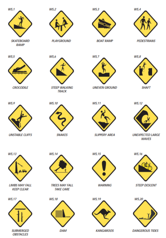
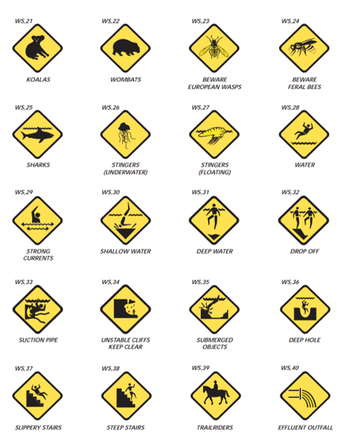
The warning recommendations (yellow diamond symbols) should be limited (wherever possible) to a maximum of four per sign, based on the four most significant hazards.
The recommended warnings should be reviewed for appropriateness and the decision on what to include remains with the land manager.
The positioning of symbols on a multiple sign should be given careful consideration; their positioning will affect how successfully the sign is read and understood.
It is mandatory to use supplementary text symbols to explain their intended meaning and this text should clearly relate to the safety sign or beach safety flag symbol which it accompanies.
The minimum height of symbols should take into account the needs of people with normal sight and people with visual impairments. Relevant values for distance factor (and subsequent height) are detailed further below.
Hazard warnings
Hazard and warning signage is subdivided as follows:
HAZARD SIGNS | EXPLANATION |
Danger Signs | Signs warning of a particular hazard or hazardous condition that is likely to be life-threatening |
Warning Signs | Signs warning of a hazard or hazardous condition that is not likely to be life-threatening. |
The term caution used in earlier guidance has now been replaced by the term warning. The two terms are regarded as being interchangeable.
Warning signs may be either triangle or diamond in shape. Either option is appropriate as long as they are used consistently.
Symbols should be accompanied by the relevant text to clarify the hazard shown. For example: ‘Shallow water’ and ‘Sand bar’ may use the same symbol.
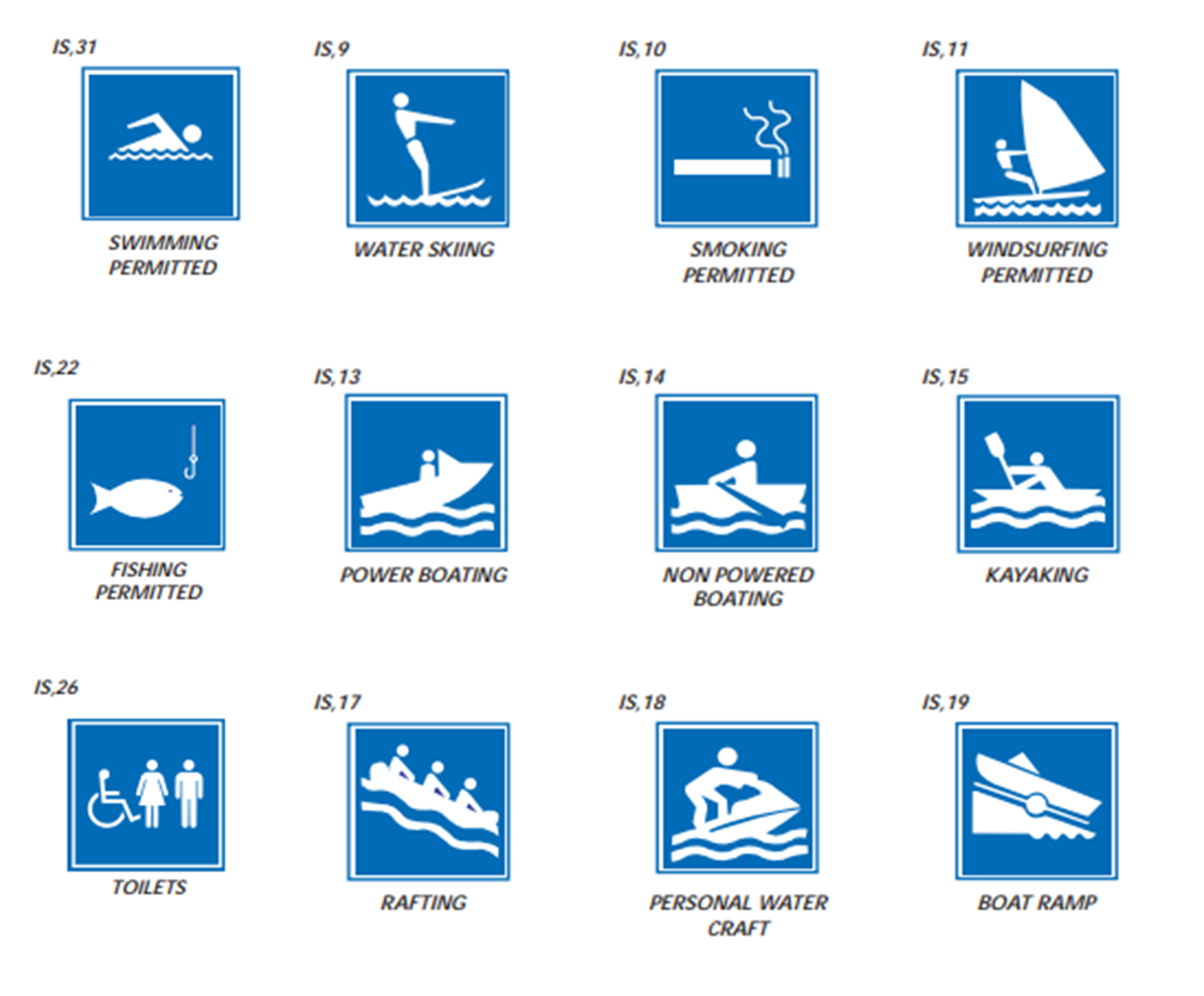
Information signs
Information signs are used to show what areas of a waterway are suitable for certain activities.
Safety information
Decisions on whether to include specific safety information will influence the effectiveness of the signage in guiding behaviour.
The inclusion of standard aquatic supervision symbol and wording promotes the active supervision of children around water. Standard aquatic supervision signage for the supervision of children around water is recommended on all aquatic safety signage.
Regulatory signs
Local regulations and policy
Separating local regulation signage (e.g. no dogs) from safety signage helps to retain focus on crucial aquatic location safety information.
Safety information such as warnings and hazards should take significant primacy over local regulation signage, given its significance in lifesaving.
Local regulation signage (if required) must be provided in a way to ensure this information does not take away attention from important safety related advice on display.
Regulation signage may be on the same post as the safety signage, however, is recommended to be presented on an individual panel, and sized appropriately (e.g. smaller than warning and hazard information), to assist with prioritising the importance of matters, ensure currency and facilitare easy updating when content items (rules) are changed.
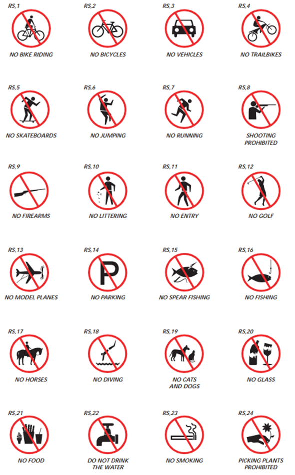
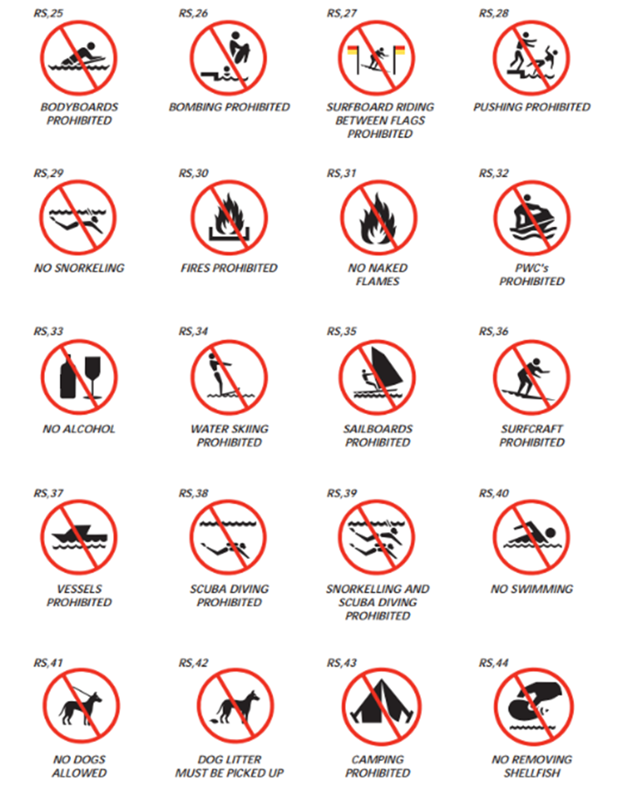
Signs containing instructions with which failure to comply constitutes either an offence at law, or a breach of standing orders, safety procedures or other directions, depending on which kind of control has been imposed at the aquatic location. They are subdivided as follows:
REGULATORY SIGNS | EXPLANATION |
Prohibition Signs | Signs that indicate that an action or activity is not permitted |
Mandatory Signs | Signs that indicate that an instruction must be carried out |
Limitation or Restriction Signs | Signs that place a numerical or other defined limit on an activity or use of an area. |
Other considerations
Culturally and Linguistically Diverse Messaging Efficacy
Where there are to be words on a sign, is it likely that the meaning of the sign will need to be conveyed to persons not familiar with the English language.
There is mixed literature on the efficacy of multilingual signage with several studies suggesting that multilingual signage does not always significantly enhance safety outcomes in multicultural settings. While the intent is to improve comprehension, effectiveness can vary due to increases to cognitive load for the average reader of the sign.
Keeping messages clear, consistent and using the appropriate symbols and English text, accompanied by providing the recognised interpreter symbol and a QR code which links to information in multiple languages, or an interpreter service is an appropriate way to provide safety information to persons from diverse, multicultural and multilingual backgrounds.
Accessibility
Braille signage, when strategically placed, can play a crucial role in enhancing accessibility for visually impaired individuals in open areas such as parks. The presence of Braille on signs allows these individuals to navigate independently and safely, thereby promoting inclusivity and equality in public spaces.
However, there are significant implementation challenges which require meticulous planning and resources, which may not be reasonably practical in all circumstances.
Studies highlight that Braille signs are most effective when they are part of a broader accessibility strategy, including tactile maps and wayfinding tools.
Consideration should be given (where relevant and practicable) to include tactile signage (including braille) for people with vision impairments.
See also mounting heights and materials below for additional considerations.
Colour
The use of colour in a signage scheme can establish a visual look for the scheme. Colour selection is important as a multiple sign need to be easy to find in the aquatic environment. It is essential that the colour contrast between the colour of the text and the colour of the sign background should be carefully considered to ensure legibility.
The combination of red and yellow are colours commonly associated with aquatic environments and lifeguards and therefore should be used on multiple signs in and around aquatic environments. Safety symbols and supplementary text should be displayed in a manner which ensures optimum legibility.
Lighting and Illumination
If artificial lighting is provided, effective illumination is required both in normal and in mains-failure conditions, if applicable.
There are various ways of ensuring the satisfactory illumination of signs.
Some types of lighting, e.g. low pressure sodium do not enable effective colour recognition and are therefore unlikely to be suitable for the illumination of water safety signs.
Where a sign is illuminated by an external artificial light source, the vertical illumination should be a minimum of 100 lux under normal lighting conditions.
Signage Environment
Signage should be selected to be suitable for their operating environment. Key considerations for an inland waterway location that should be considered include:
- interior or exterior use
- durability of base material
- durability of graphical content
- colour/light fastness
- resistance to damage from bather traffic or from cleaning
- resistance to exposure to water
- resistance to corrosion
- resistance to graffiti
- flame resistance
- type and suitability of fixings
- resistance to wind loads.
Use of QR codes (or similar)
Introducing QR codes adds an interactive element to the signage, providing users with immediate and contemporary access to safety information.
Consideration should be given to the introduction of a QR code into the proposed signage. This QR code should direct the user to a location where accurate information is available with regards to the safety of the aquatic location.
The RLSSA has prepared a number of QR codes which link to endorsed safety information on our website. Please contact RLSSA for further information.
Materials, construction and physical properties
With the exception of vehicle signage and pedestrian safety, material selection should include the use of non-reflective surfaces for information to be perceptible to people with vision impairment and sensory sensitivities
Material selection should focus on the mitigation of maintenance and vandalism by specifying hard wearing, durable materials
Wayfinding
An integrated wayfinding theme enhances visual appeal and functionality.
In general, the wayfinding theme should incorporate the same design parameters as provided by the various standards and legislation for aquatic safety signage at any aquatic environment.
The dissemination of aquatic location safety information needs to be strategically planned. Information should be accessible at key decision-making points, including arrival areas and car park interfaces.
Warning symbols must be provided at a minimum at car park arrival points, ensuring that vital information is immediately available to those accessing the area.
Sign Types
Sign types for best practice in aquatic safety signage include:
- Road signs
- Primary access / entrance signs
- Secondary access / entrance signs
- Individual hazards and regulation signs
- Beach signs, flags and symbols
- Fauna signs
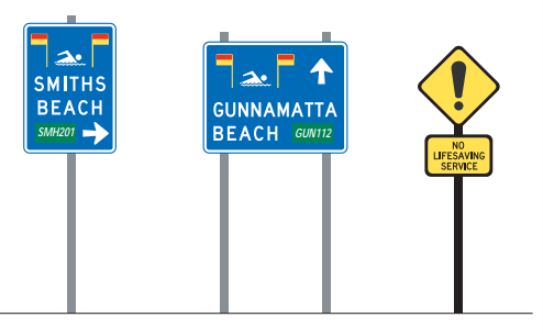
Approach signs
Approach signs may be appropriate when directing traffic to specific areas with lifesaving services such as an inland beach with lifeguard services. This sign is characterised by white lettering on a blue background and should include information symbols.
Emergency Markers should be white on a green rectangle.
There may also be a need for warning symbols such as ‘no lifesaving service’. These signs shall be comprised of a black symbol and border on a yellow diamond or triable background.
Primary access/entrance signage
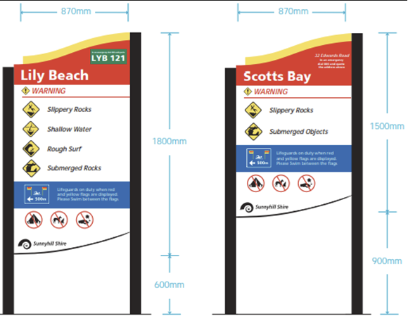
Primary access signs should be placed at natural main entrances (including carparks) to areas on the inland waterway where users access the aquatic environment. The exact position will depend upon the nature of the environment.
The pathway to an inland beach or boat ramp for example would be an obvious location to erect an appropriate sign detailing the hazards, risks, prohibitions and safety considerations relevant to the location.
Primary access signs are usually in the form of a multiple sign and should include key safety information and rules applicable to the entire aquatic environment.
Primary signage should be:
- Situated to promote readability
- Placed at an appropriate mounting height
- In an area free from secondary signage/visual distraction
- Placed near or at the start of an access track
- In a location where the width of the track is minimal
- Positioned so as not to be obscured as visitors stop to read the sign
- Not positioned where the sign becomes a hazard itself
Primary signage should be made up of four sections in the following hierarchy:
- Location name and emergency marker (if applicable) or street address
- Hazards within the designated area
- Lifesaving service (if applicable) or safety information
- Regulations
Primary signage should include the following safety information:
- Location information/contact details
- Hazards and Warnings
- Information
- Regulations/prohibitions
Location names should be displayed in white on red backgrounds.
Secondary access/entrance signage
Secondary access signs should be used at pedestrian entrances or entrances to specific aquatic environments. These signs should be placed at each entrance that is not a main entrance, e.g. a small footway, side access or minor path access.
These signs can also be used to reinforce an entrance area such as an access path and should be fixed at regular intervals along an open access way.
Secondary signage should follow the same principles as primary signage.
There are two types of secondary signage:
- Defined access signs – which should be used where access to the inland waterway or reserve is controlled via a narrow pathway; and/or,
- Open access signs – which should be used for areas where access is not limited to pathways or alternatively for wide pathways
Secondary signage should include the following safety information:
- Location information/contact details
- Hazards and Warnings
- Information
- Regulations/prohibitions
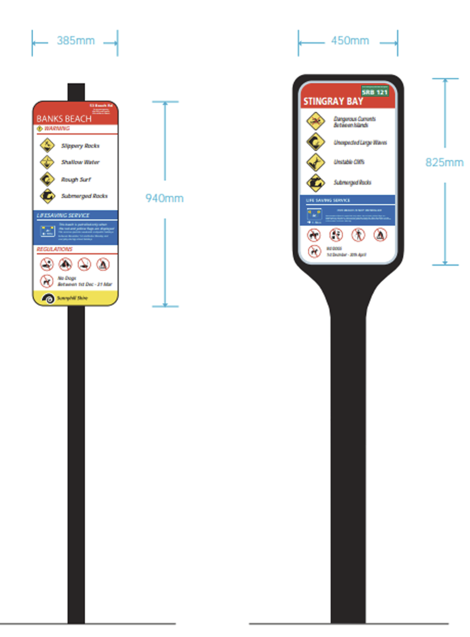
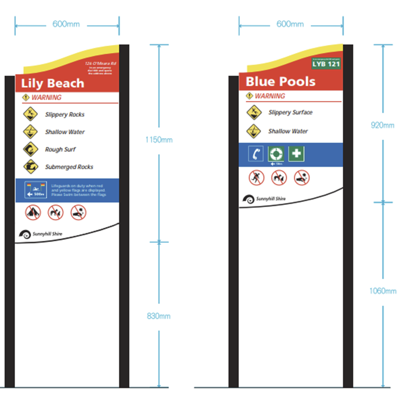
Where access to the inland waterway is open, such as along the banks of a river in a city location, sufficient secondary signage should be installed to reasonably inform a person who may access the waterway as to the risk, taking into consideration the placement of access routes to the waterway, which could include buildings, shops, roads, and walkways.
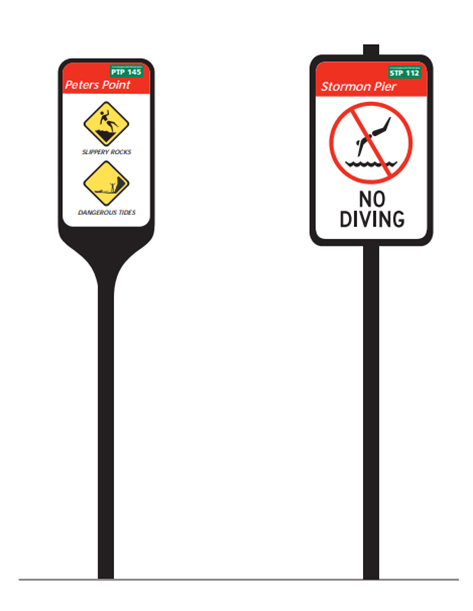
Individual Hazard and Regulation Signs
Individual hazard signs should be used where a hazard is localised and has been identified at a level of risk that warrants sign posting. Examples may include unstable banks, slipper rocks and no swimming.
Individual signs may also be used for displaying regulations.
Readability of Aquatic Safety Signage
Sign height & viewing distance
A sign should be both visible and legible at the maximum viewing distance.
The required maximum viewing distance of a sign should be determined by its position within the area and take into account the needs of people with normal sight and people with visual impairments.
The following principles should be applied to assist users of the inland waterway to predict the location of successive signs, whether they are mounted on walls, posts or overhead.
- Signs should be mounted as close as practicable to the observer’s line of sight in the vertical plane. For a standing adult, this will be approximately 5° up or down from a point 1500 mm above ground level in front of the observer (approximately 900-1800 mm above the ground).
- Signs that are freestanding or mounted overhead should be placed so that they are not a hazard and do not enter into the required space for a clear and accessible path
- Where practical, the space in front of the sign should be clear so that people without correction lenses or with visual impairments are able to approach the sign to reduce their viewing distance.
- Placed so as not to be obscured by vegetation.
The recommended maximum viewing distance for a particular sign height (h) in millimetres (mm) is calculated as follows:
- Distance Factor x Sign Height = Maximum Viewing Distance or;
- Maximum Viewing Distance/Distance Factor = Sign Height
Whereas mounting height should always be around 1700mm, the below table identifies the viewing distance and sign height that may be most useful for an inland waterway location:
| Viewing Distance (m) | Minimum Sign Height (mm) | Recommended Sign Height (mm) |
|---|---|---|
| Up to 5 | 100 | 150 |
| 5 to 10 | 200 | 300 |
| 10 to 20 | 300 | 400 |
| 20 to 30 | 400 | 600 |
| 30 to 50 | 600 | 900 |
| 50 to 100 | 1200 | 1500 |
Symbol height & viewing distance
The below table identifies the viewing distance and symbol height that may be most useful for an inland waterway location:
| Viewing Distance (m) | Minimum Height (mm) | Recommended Height (mm) |
|---|---|---|
| Up to 5 | 65 | 75 |
| 5 to 10 | 100 | 150 |
| 10 to 20 | 150 | 200 |
| 20 to 30 | 200 | 300 |
| 30 to 50 | 300 | 450 |
| 50 to 100 | 450 | 600+ |

Text to support signs
Different types of signs and sections within signs will have different viewing distances; therefore a selection of type sizes is necessary. The minimum height of letters should take into account the needs of people with normal sight and people with visual impairments.
The minimum letter height should be determined by dividing the required maximum viewing distance by the relevant distance factor.
The below table identifies the viewing distance and letter height based on distance factors:
| Viewing Distance (m) | Minimum Letter Height (mm) | Recommended Letter Height (mm) |
|---|---|---|
| Up to 5 | 15 | 25 |
| 5 to 10 | 40 | 50 |
| 10 to 20 | 60 | 75 |
| 20 to 30 | 80 | 100 |
| 30 to 50 | 120 | 150 |
| 50 to 100 | 240 | 300 |
The image below identifies how the measurement of height is considered for letters.

The supplementary text should not be used on its own.
The layout of supplementary text signs should be in accordance with the relevant standards.
Lettering arrangement
Where a signal word is used on a supplementary text sign used with a warning sign, the text after the signal word should start on a new line; the initial letter of the first word should be upper case and the remainder of the wording should be lower case. E.g.:
Danger
No Swimming
Typeface (font)
The type in a multiple sign should allow for viewing distance considerations.
Sans serif font should be used.
Text should be horizontal, left aligned or cantered, well spaced and an appropriate size to be readable from the relevant viewing distance.
There should be a strong contrast between the typography and the background.
Specific considerations
Lifesaving services information
Clear information about available lifesaving services aids in public awareness and enhances safe aquatic activity.
Where an aquatic location is patrolled the recommended wording is: ‘This aquatic location is patrolled when the red and yellow flags are displayed by lifeguards.’
Where an aquatic location is not patrolled the recommended wording is: ‘This aquatic location is not patrolled by lifeguards. The nearest patrolled aquatic location is [X].’
Both above are complimented by the standard ‘patrolled aquatic location’ symbol along with a distance and direction to the nearest lifeguard service and/or patrol location.
In the context of inland waterways, it may be that there are no lifesaving services on the inland waterway, but nearby there is an aquatic facility with lifeguards. It is suitable (and encouraged) to direct potential swimmers to a nearby aquatic facility.
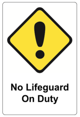
If there is no lifeguard supervision provided at a known location for swimming and aquatic recreation on the inland waterway, a ‘No Lifeguard on Duty’ sign should be prominently displayed.
Moving water
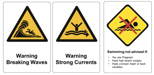
In rivers and other moving water waterways, signage should be used to indicate hazards relating to the movement of the water relevant to its pace and size. This may include:
- Strong currents
- Breaking waves or
- Swimming is not advised if:
- Pregnant
- Had recent surgery
- Have a known heart condition
- Have known back condition
Parental supervision
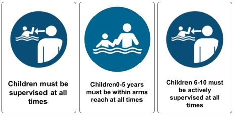
Signage should include information relating to the supervision of children at the aquatic location.
The recommended wording is: ‘Children must be supervised at all times’
Beach signs
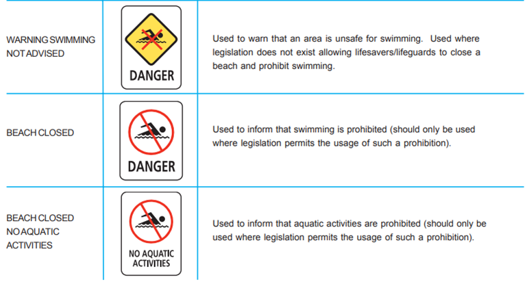
Beach signs should be posted for beaches (as applicable) by the responsible person.
Amusement Devices Safety Signage
Display of rules (if applicable)
The owner or operator of an inland waterway or the land providing public access to the inland waterway with an aquatic amusement ride or device (such as a slide or inflatable) should:
- display adequate information on the possible effects the use of a ride or device may have on users; and
- instruct operators of devices on the importance of carrying out, at all times, any oral instructions for users as may be necessary for their safe participation in the device.
The following information (or variations thereof for specific rides or devices) for users should be considered for display at appropriate locations:
- There are inherent risks in the participation in or on an amusement ride or device. Users, by their participation, accept the inherent risks of which a prudent person is or should be aware. Users should consider this participation an exercise in good judgement and act in a responsible manner while using the amusement ride or device.
- Users have a duty not to participate in or on any amusement ride or device when under the influence of alcohol or drugs.
- Users have a duty to act with good judgement and consideration, both for themselves and others, and to refrain from behaviour which could affect their safety, the safety of other users, or the safety of the device itself.
- Users have a duty to obey all reasonable written, and particularly oral, instructions and warnings, given by the proprietors or operators of any ride or device, without objection.
- Users have a duty to use, as instructed, all safety equipment provided when participating in any ride or device. Users choosing to supply their own safety equipment do so at their own risk and accept full responsibility for any failure or non-performance of such equipment.
- Users of amusement rides or devices have a duty to assist in any investigation of any incident they may have witnessed or in which they may have had some involvement and to inform an investigation as to any contribution from their own actions.
Owners or operators of amusement rides or devices should display such information on appropriate signage at the point of entry and/or point of sale (if applicable).
Emergency and Rescue Equipment
Displaying well-recognised, standardised safety signage will assist in easily locating first aid equipment and facilities. First aid signs may be constructed to suit individual requirements but should comply with AS 1319: 1994 – Safety Signs for the Occupational Environment.
At a minimum this should include signs where the following items are located at an aquatic location (as applicable):
- First aid kits
- Defibrillators
- Rescue equipment
- Oxygen equipment
- Spinal equipment
- Emergency telephones
- First aid room/station
- Emergency eye wash
- Emergency safety showers
- Spill kits
- Emergency assembly points
- Safety data sheets
- Emergency stops
Emergency Evacuation and Assembly Points
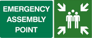
The owner and/or operator of an aquatic location should ensure appropriate signage to signal the location of any emergency evacuation routes and/or assembly points.
References
- Australian Water Safety Council. (2006). National Aquatic & Recreational Signage Style Manual. Sydney, Australia: Australian Water Safety Council.
- International Organization for Standardization. (2004). Classification, performance and durability of safety signs (ISO 17398:2004). Geneva, Switzerland: ISO.
- International Organization for Standardization. (2017). Graphic Symbol – Public Information Symbols (ISO 7001:2017). Geneva, Switzerland: ISO.
- International Organization for Standardization. (2019). ISO 7010:2019 Graphical symbols — Safety colours and safety signs — Registered safety signs. Geneva, Switzerland: ISO.
- International Organization for Standardization. (2008). ISO 20712-1:2008 Water safety signs and beach safety flags — Part 1: Specifications for water safety signs used in workplaces and public areas. Geneva, Switzerland: ISO.
- Royal Life Saving Society – Australia. (2016). Guidelines for Safe Pool Operations: Aquatic Signage. Sydney, Australia: Royal Life Saving Society – Australia.
- Saunders, R., Weiler, B., Scherrer, P., & Zeppel, H. (2019). Best practice principles for communicating safety messages in national parks. Journal of Outdoor Recreation and Tourism, 25, 132-142. https://doi.org/10.1016/j.jort.2018.01.006
- Standards Australia. (1994). Safety Signs for the Occupational Environment (AS 1319:1994). Sydney, Australia: Standards Australia.
- Standards Australia. (2004). AS 1319-2004 Safety signs for the occupational environment. Sydney, Australia: Standards Australia.
- Standards Australia. (2002). AS 2416-2002 Water safety signs and beach safety flags. Sydney, Australia: Standards Australia.
- Standards Australia, & Standards New Zealand. (2010). Water Safety Signs and Beach Safety Flags Part 1, Part 2 and Part 3 (AS/NZS 2416.1:2010). Sydney, Australia: Standards Australia.
- World Health Organization. (2003). Guidelines for safe recreational water environments. Geneva, Switzerland: World Health Organization.
